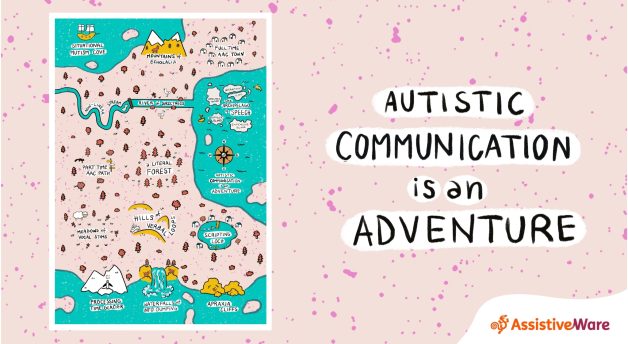
What are intermittent, unreliable, insufficient, and expensive speech?
This article explores some of the varied experiences autistic people can have navigating the space between non-speaking and fully speaking.
Curious about echolalia?
This article breaks it down in a straightforward way, showing how echoing speech isn't just about repetition but about connection, processing, and self-regulation.

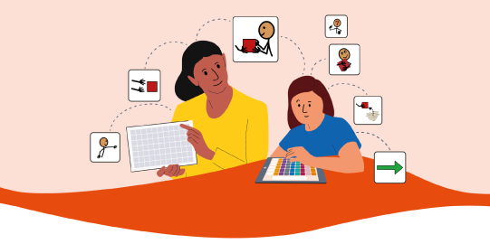
What is AAC?
Find out more about Augmentative and Alternative Communication (AAC), and how to support people who cannot rely on speaking.
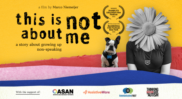
AssistiveWare proudly supports “This Is Not About Me”
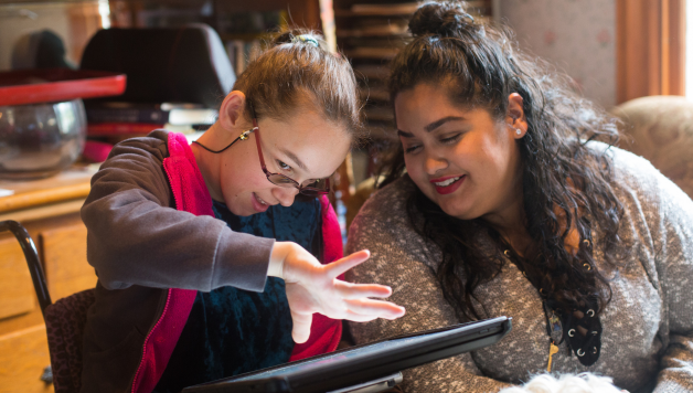
Autistic and non-speaking. Stuck in an educational system that has given up on you. Restrained or rewarded with candy. This is Jordyn Zimmerman’s story and it is shared by so many other students.
This is why AssistiveWare is a proud supporting partner of the film This Is Not About Me.
